the project
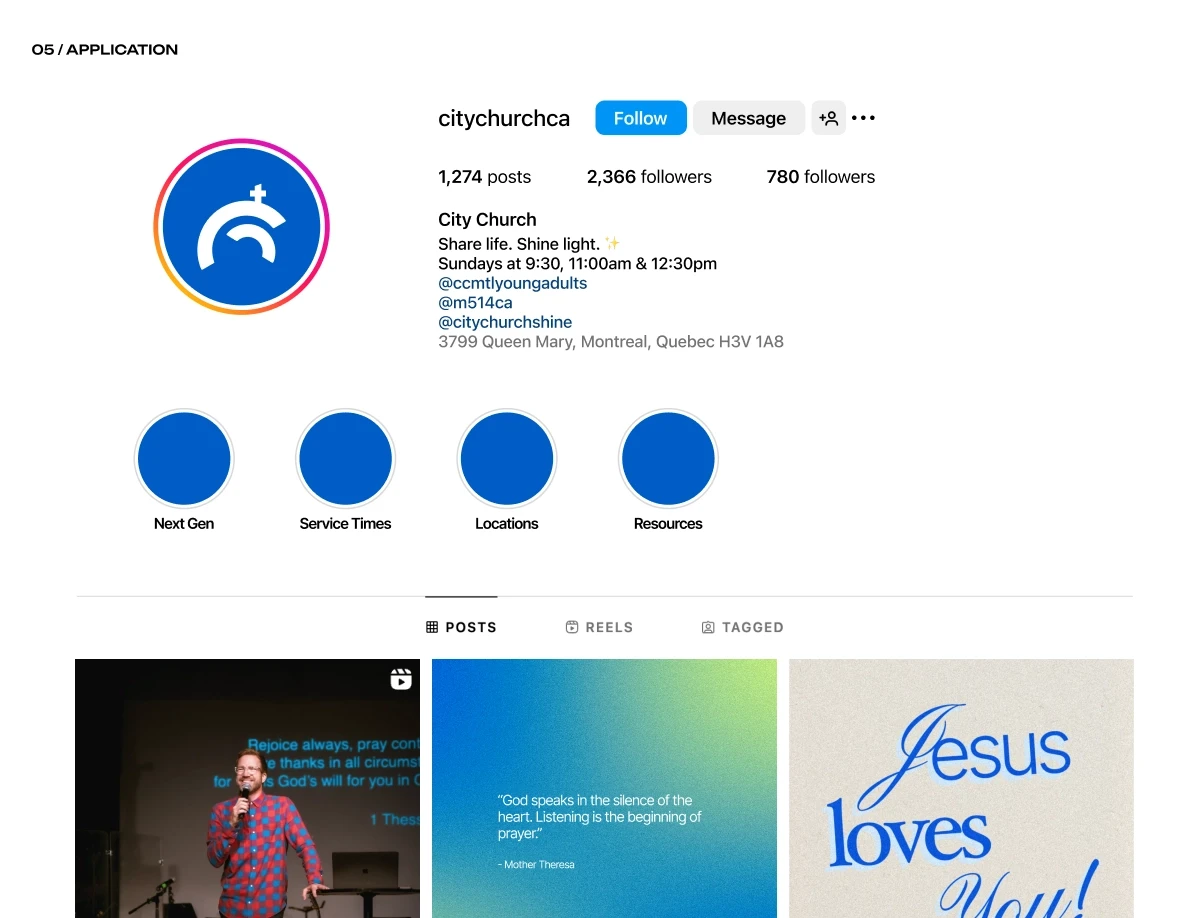
City Church
Services
Brand Identity, Website, Social Media
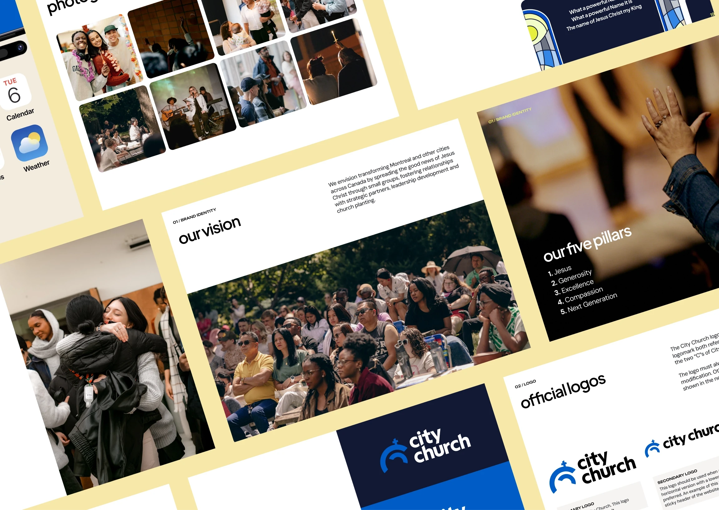
Time for a refresh
With a logo that was now well over 12 years old and with no proper brand guideline, City Church was due for a brand refresh.
Same, but different
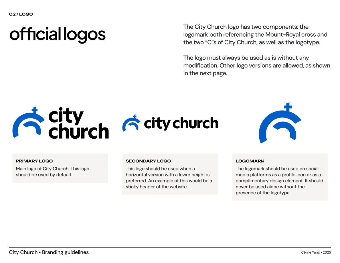
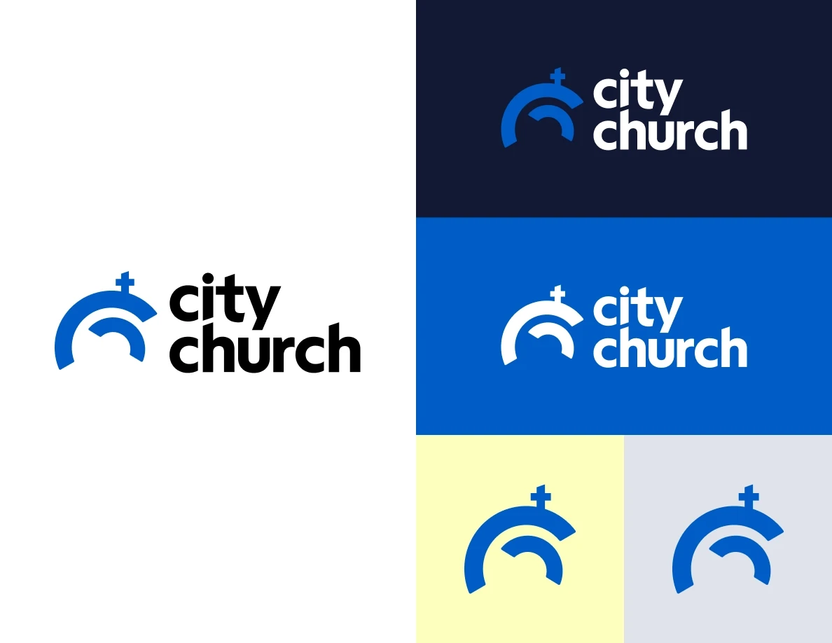
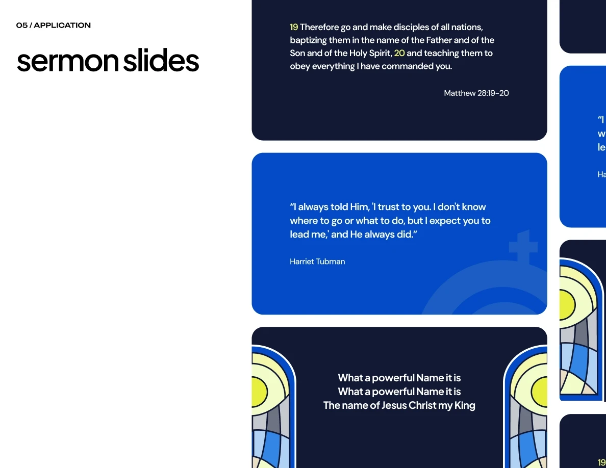
We simplified its blue tones and gave the logo a softer look, while keeping its distinctive double C logomark that represents the cross on Mount Royal.
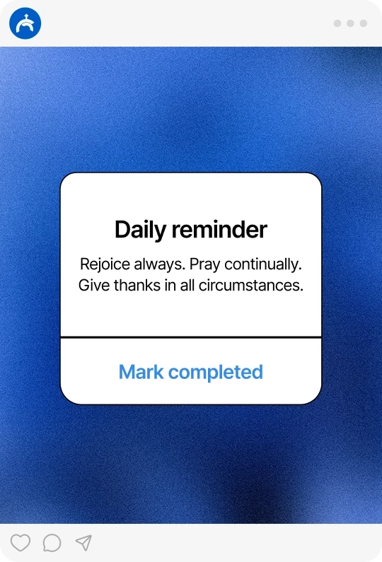
Share life, shine light
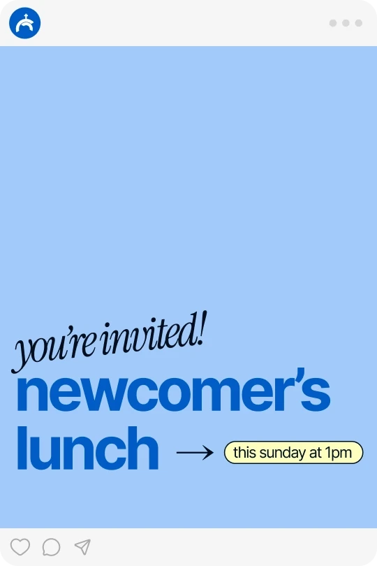
We introduced a new tertiary shade of yellow to represent its tagline, "Share life, shine light".
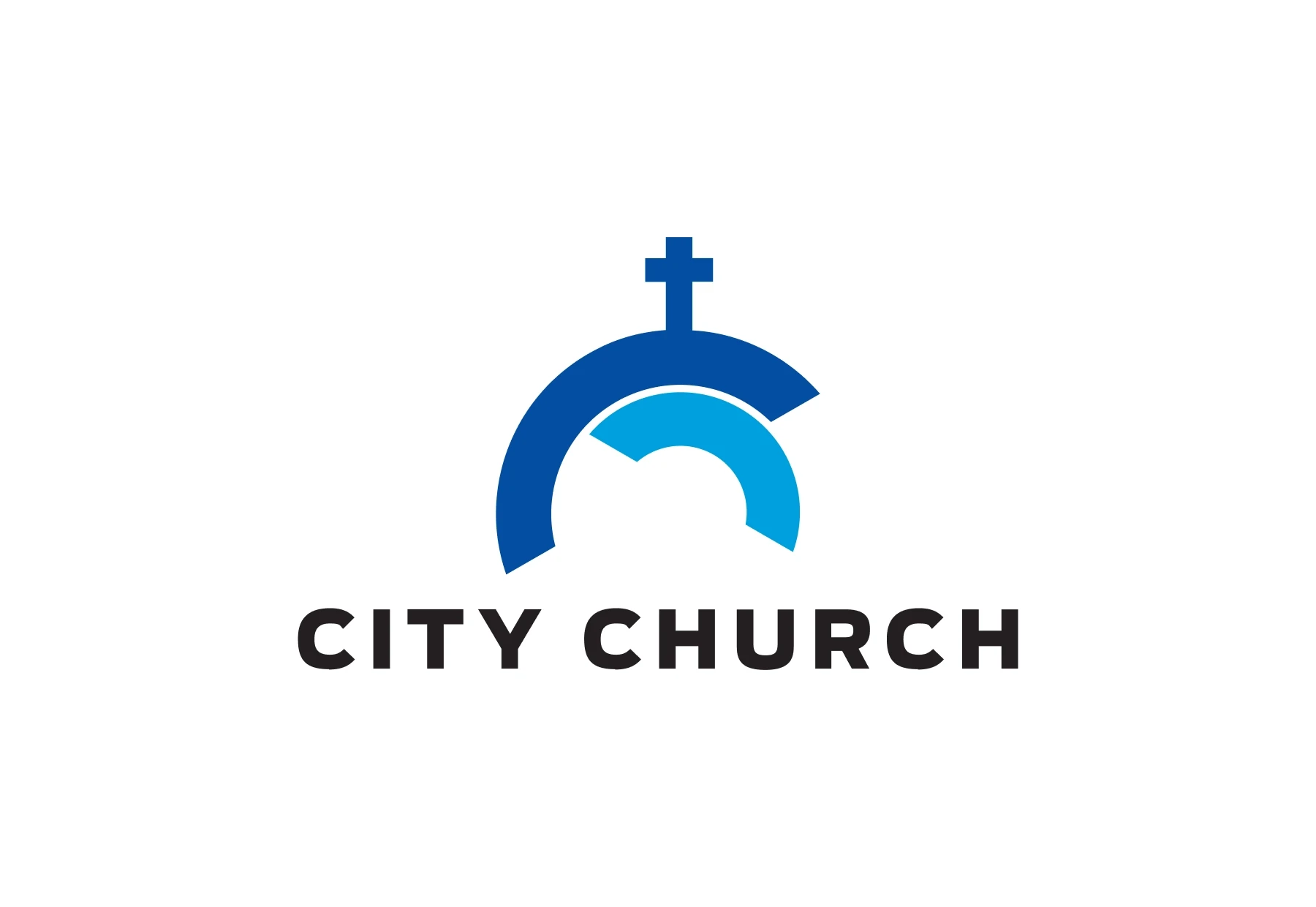
Old logo
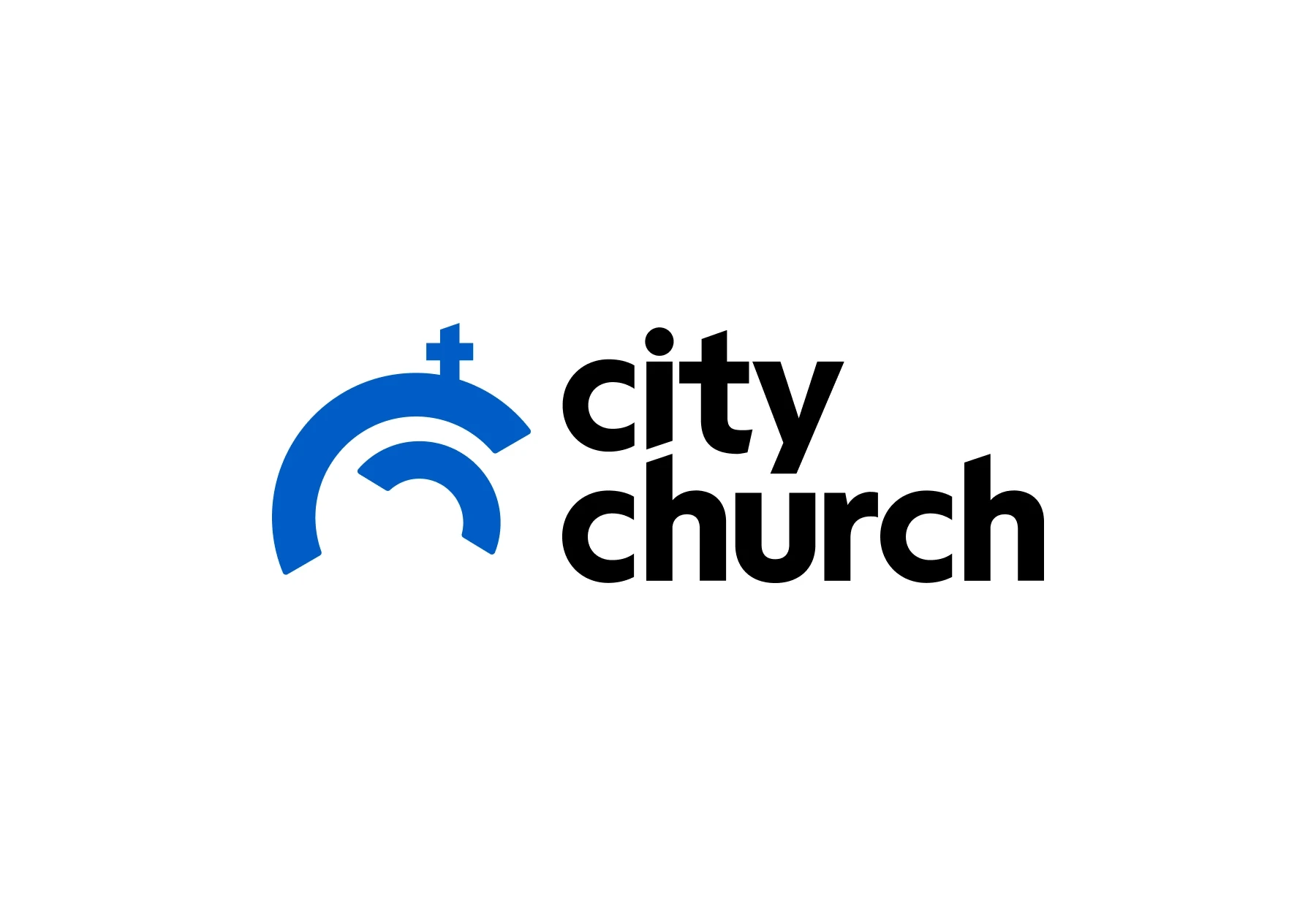
New logo

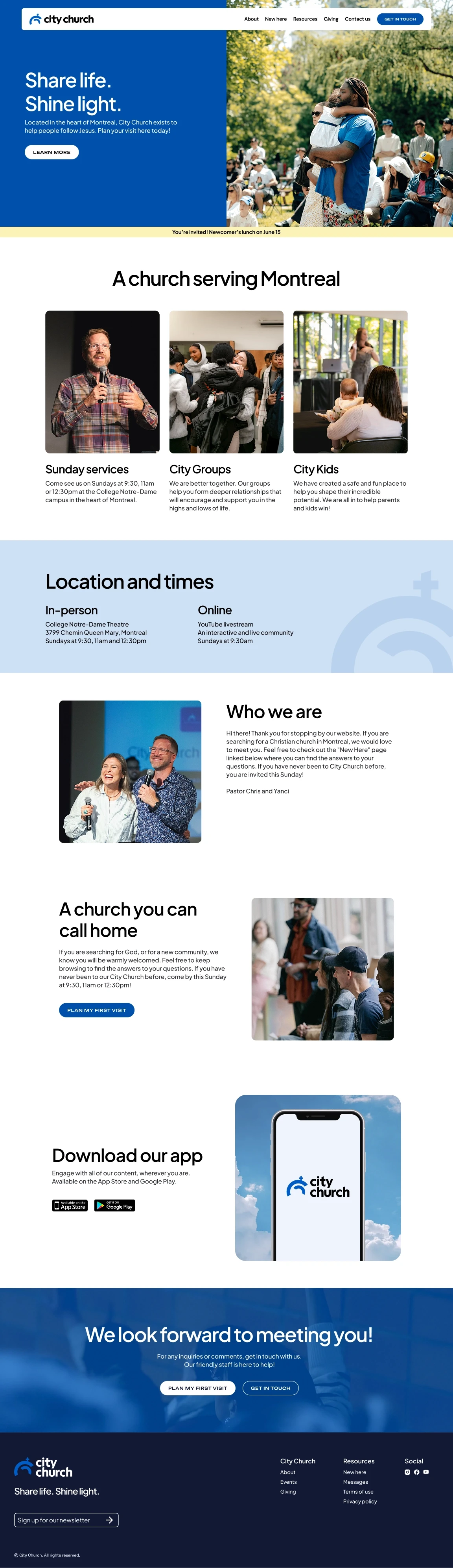
Elevate your digital presence.
Fill out our form to get started or to ask any questions. We look forward to connecting with you!